A brief investigation into solar activity and Morris Climate
Periodicities in the temperature data
Correlations between sunspot numbers and monthly temperatures
Background story
The question was brought up, when the American Astronomical
Society in its June meeting announced that solar activity for the next solar
cycles is expected to become minimal (for example here: http://www.space.com/11960-fading-sunspots-slower-solar-activity-solar-cycle.html)
. Three different indicators seemed to point that way: the upswing to the next
sun spot maximum is slower than during several previous cycles, a torsional jet stream failed to appear in the expected
strength during the past two years, and a weakening of the coronal magnetic
field. It was mentioned that this solar activity decline could be compared to
the Maunder minimum, which in some publications is associated with a cold
period in Europe in the late 17th, early 18th century.
This was referred to as the Little Ice Age (LIA). The term is used in a quite
stretched manner, since other indications put the beginning of this cool period
to the end of the 14th century, or even to the year 1343, in which
the Vikings abandoned their last
In any case, it would be interesting to explore whether there really is a connection between the number of sun spots and terrestrial weather and climate, or if this factor becomes overwhelmed by other terrestrial oscillations. The number of sun spots is an indicator of solar activity. While in general the sun spots themselves are cooler and therefore emit a lot less visual radiation, the solar energy output during a solar maximum is greater and more variable. Should this show in the temperature behavior of place on Earth?
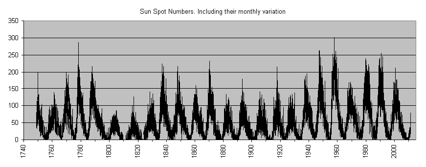
Empiricism may help to guide us through the darkness. Below I am putting together results from the analysis of 90 year of Morris weather data, collected by the Co-op, and sun spot numbers from NOAA.
Back to top Back to Morris Weather Archive Back to UMM Weather Station
The sun spot cycle:
A Fourier analysis of the ssn data reveals a near-perfect 11-year cycle for the solar oscillation
The Fast Fourier Transform (FFT) reveals the periodicity immediately:
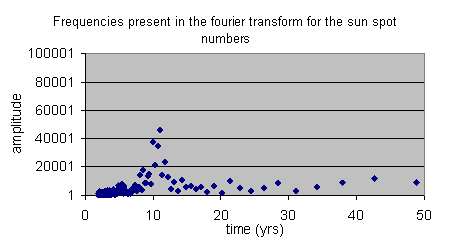
The maximum is clear at 11 years, but there is some variation possible. A little bit of checking shows, that the solar constant indeed is highest when the number of sun spots is at maximum. Also, the variation in the solar constant is much larger at the maximum of the solar cycle, see http://acrim.com/timeline2.htm.
Back to top Back to Morris Weather Archive Back to UMM Weather Station
Periodicities in the temperature data
I am using the monthly mean, maximum and minimum temperatures since 1920. An initial viewing of the 5year running average had revealed an oscillatory behavior, however, all analysis below is done on the raw data set.
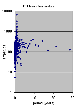
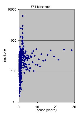
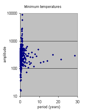
All of the FFTs exhibit a sharp maximum at 1 year – which is good. It means the FFT did something reasonable. The most prominent feature in the temperature cycle is the annual cycle, of course. There is a very weak maximum at 10.6 years, sometimes more at 9.5, sometimes more at 12.8 years. Also, all three series have a shallow maximum at 17 years. Other periods include something very weak around 3.7 years (El Nino??).
Back to top Back to Morris Weather Archive Back to UMM Weather Station
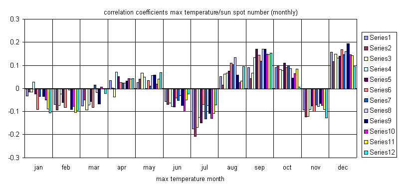
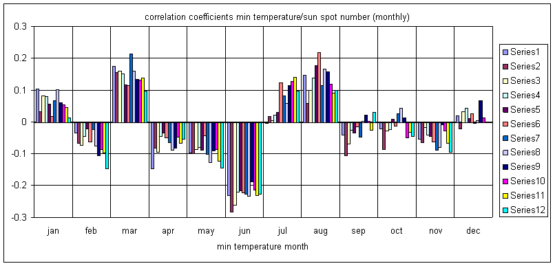
Correlations between sunspot numbers and monthly temperatures
Another way to assess relationships between the data set of sun spot numbers and temperature is to use the monthly numbers, and look for correlations. In other words: Do high sun spot numbers correspond to warmer months? The answer to this questions is not simple, since it appears to vary throughout the year.
The correlation coefficient R compares two data sets with respect to linear dependency. Perfect proportionality means R=1 ( both numbers grow proportionally) ; completely random and no relationship whatsoever means R=0; perfect negative proportionality means R=-1 (one grows, and the other decreases proportionally).
The two pairs of data with the strongest positive and negative correlation are shown below:
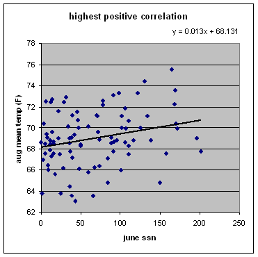
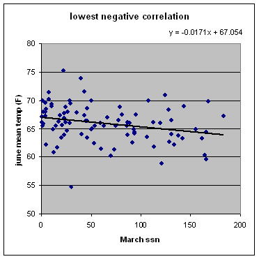
The highest positive correlation occurs between the number of sun spots in June and the monthly mean temperature in August. A high sun pot activity in June leads to a warmer August, with delay. The lowest negative correlation occurs between the sun spot number in March and the mean temperature in June. The more sun spots in March, the cooler the June of the year. All data are strongly stochastic, and neither of the correlation coefficients is larger than 0.3.
So, next we check out the correlations for all sun spot
months and all monthly temperatures for monthly mean, maximum and minimum
temperatures: 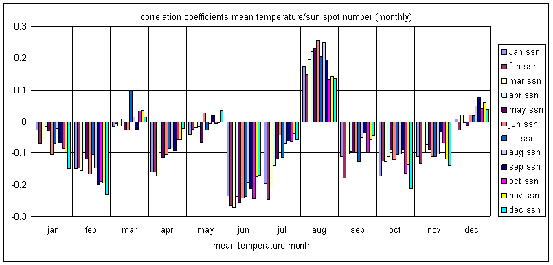
Back to top Back to Morris Weather Archive Back to UMM Weather Station
What does any of this mean?
Here are a few points:
- More longitudinal data sets must be examined, preferably from different latitudes, and as far back reaching as possible.
- The influence of solar variation (in terms of energy see http://acrim.com/timeline2.htm) is small, and nearly not detectable in this single 90-year data set.
- Negative forcing appears to occur for May, June and July, which means that higher solar activity results in slightly cooler temperatures for those months.
- Positive forcing seems to play a role in July, August, possibly September. This means, that higher solar activity leads to warmer temperatures in those months.
- Other months appear random or inconclusive.
- Why the summer months? The general energy budget for the region is running an excess during May through August, but a deficit otherwise. We are looking at the input side of the equation (energy content of region = solar input + advection – Irradiationout +/- some other terrestrial stuff). Since the main energy input is solar radiation, and this is the excess term during May through August, it is to be expected that the summer months are most influenced by any solar variation.
- The randomness of March, and even of Oct/Nov may be associated with a much stronger influence: the migration of the jet streams across our area. northward in March, southward in fall. In those occasions, advection, or the energy transported by storm systems may dominate the ultimate mean temperatures. It also means generally a change in dominant air mass, for example from polar continental to polar maritime to tropical maritime/ tropical continental as spring proceeds. That would override any influence of a small solar variation.
- Why first negative then positive? No clue. It is almost certainly an effect of the global response, possibly jet positions, or increased melting, or other. A comparison with other data sets might give enlightenment. It is also possible that I misinterpret data.
- There are differences between the correlations of mean, maximum and minimum temperature data. It is worth remembering that max/min data refere to one single temperature reading at one time during the respective month. Mean temperatures are averaged over the complete month, and might be considered more representative.
- What is this 17 year cycle???
Any thoughts? Tell me sboyd@morris.umn.edu
Back to top Back to Morris Weather Archive Back to UMM Weather Station
Last updated 6/16/2011 11:08 PM
By Sylke Boyd, Physics, UMM